Mangazine, Sentai, and the Ninja High School Yearbooks
My work appeared in several Antarctic Press publications during the late '80s and through the '90s.
I've covered my major works, like Zetraman and Chesty Sanchez, elsewhere in this blog. However, there are some short stories and one-shots that also deserve mention:
(Cover art by Paul Roche)
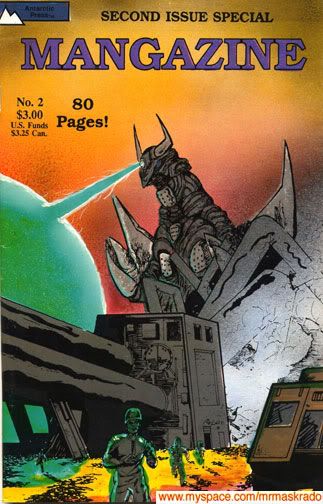
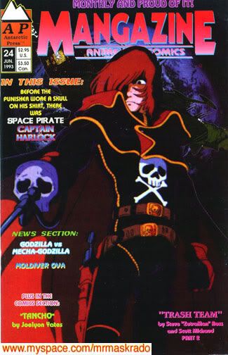
Mangazine started out as a showcase for new talent.
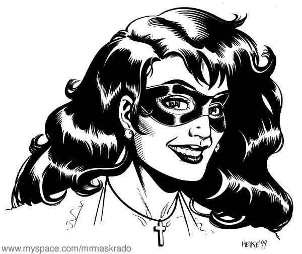
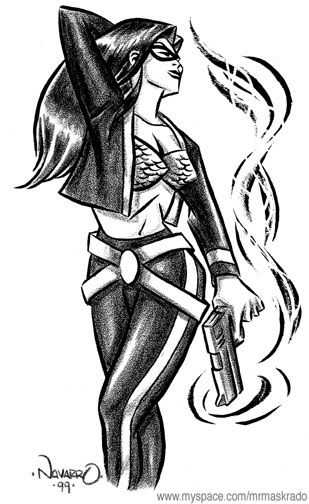
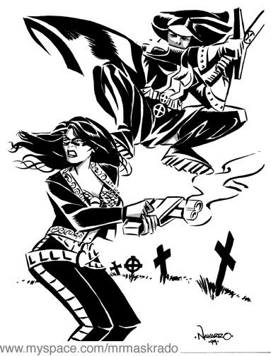
My Crimzon story appeared in the second issue of Mangazine Volume 2 (above).
In those days, neither Japanese-style comics, nor the word manga, were as commonly seen or used as they are today. The definition of manga was open to interpretation, as was Mangazine's submissions policy. Not all of the stories in Mangazine borrowed from the Japanese style, but most did have Japanese-inspired elements, like giant robots and monsters.
(Art by Shon Howell)
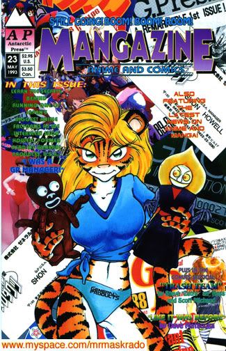
Mangazine eventually evolved into a fanzine: half of the pages were devoted to manga and anime news; the comic stories were relegated to the back half of each issue.
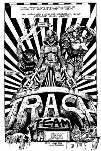
It was there that my T.R.A.S.H.Team story made its debut.
(I never did decide what T.R.A.S.H. was supposed to stand for; someday I should have a contest.)
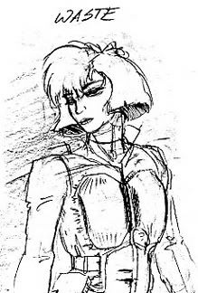
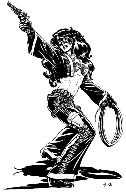
(Art by Scott Michaud)
T.R.A.S.H.Team's art and designs were by Chesty Sanchez artist Scott Michaud.
T.R.A.S.H.Team was a two-part intro that established the premise for an ongoing series.
It starred three heroes with garbage-inspired code-names:
Scrap (the skinny guy with the goggles; inventor and weapons expert),
Waste (the woman in the padded jumpsuit; martial artist and team leader), and
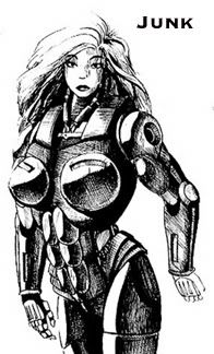
Junk (the enormous female cyborg).
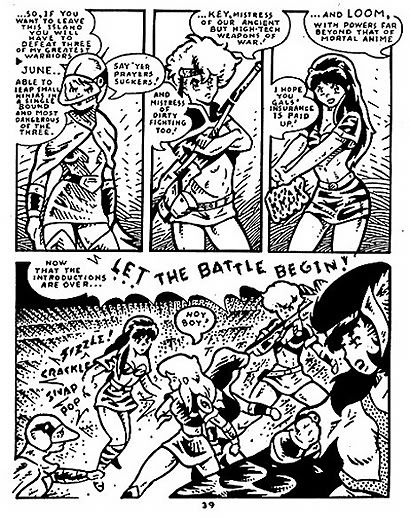
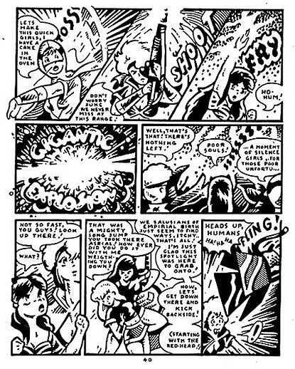
The T.R.A.S.H.Team story:
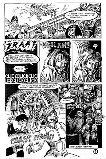
In the near future, corporate warfare isn't just a business expression: company mascots actually battle each other, and civilians get caught in the crossfire!
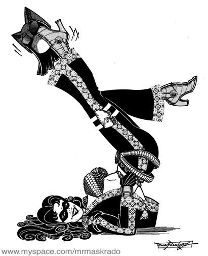
(Art by Scott Michaud)
T.R.A.S.H.Team started out as the public face of a third-rate salvage company, but their combat skills proved to be so good that they quickly eliminated the competition--literally.
Their sponsors became one of the most visible--and wealthiest--conglomerates on the planet.
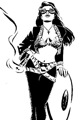
(Art by Scott Michaud)
T.R.A.S.H.Team was an action-packed, satirical, comedic story that was a lot of fun. The early artwork by Scott Michaud showed a great deal of potential.
After we finished the first two installments of T.R.A.S.H.Team, Scott and I were given the opportunity to work on a larger project with a much higher profile, which also had similar story elements: that project was Chesty Sanchez.
(Cover by Ben Dunn)
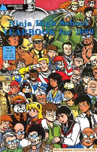
I also contributed a story to the Ninja High School Yearbook for 1989.
Ben Dunn invited fans and semi-pros to submit Ninja High School stories to be published in an annual collection. The first one was published in '89; the tradition has gone on for nearly 20 years.
My story was called Ninja Grammar School.
Ninja Grammar School is noteworthy because it's one of the first stories in an American comic book to attempt the cutesy, super-deformed/small-bodied/chibi style that's popular in Japanese humor comics. I also managed to jam-pack the five pages with jokes about and references to Project A-KO, Lone Wolf & Cub, Sukeban Deka, Kinnikuman, Kamen Rider, and Johnny Sokko.
It's the only published story in which I was both author and artist. I am not a trained artist, so...I'm not going to reprint my own artwork here.
The pages I have chosen (below) are much better, and there's an interesting story to go with them.
(Pencils by Fred Perry; inks and lettering by Lyndal Ferguson)
The Yearbook for 1989 is an ultra-rare collector's item; I've seen it sell for as much as $25.
I doubt that the first Ninja High School Yearbook's collectability is because of my Ninja Grammar School story; it's most likely because it also contains the first published artwork by Gold Digger creator Fred Perry.
Gold Digger is now one of Antarctic Press' bestselling titles, and Fred Perry is considered a favorite among fans.
However, before Fred had really proven himself as an artist and a storyteller, the editors at Antarctic had considered assigning him to draw the first Zetraman miniseries.
Fred's inking was still a little "scratchy" in those days. Since I was a huge fan of Lyndal Ferguson's unusual style, I asked him to apply for the inking job. Lyndal inked a couple of Fred Perry's pages from the Ninja High School Yearbook.
(Pencils by Fred Perry; inks by Lyndal Ferguson)
Personally, I like the results, but the Zetraman job ultimately went to Ben Dunn and Carlos Tron.
I'm very happy with the way the Zetraman miniseries turned out, and Fred Perry eventually drew his own Zetraman story, which featured villains I created.
(Cover art by Ben Dunn)
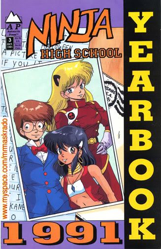
Moving on to the Ninja High School Yearbook for 1991, it contained Ramen Rider vs. the Burgermeister: I wrote the story, the art was by Debbie David.
(Ninja High School's Ramen Rider is a parody of the classic Japanese superhero Kamen Rider, briefly shown on American TV as Masked Rider.)
Debbie was a fellow Devo fan. The first few pages of our story were a "sequel"/tribute to Devo's "Worried Man" video.
She could also mix styles: her Ramen Rider artwork was a brilliant cross between old school Japanese manga and the style of original Spider-Man artist Steve Ditko.
It was such a pleasure to work with Debbie David that she was commissioned to draw the third issue of Zetraman: Revival!
(Cover art by Paul Roche)
As much as I love Japanese animation, I love their live action TV shows and movies even more.
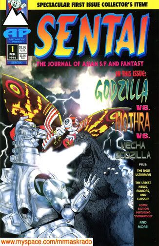
Antarctic Press publisher Ben Dunn was was such a big fan of the "tokusatsu" genre that he created a companion to Mangazine--Antarctic Press' manga and anime fanzine--and called it Sentai, after the five-man teams that appear on American TV as the Power Rangers.
I did some uncredited editorial work on the first couple of issues: I asked my friends--and experts--John Ingram, John Marshall, and David Crowe to contribute articles about Ultraman, Space Giants, and the Power Rangers.
Sentai #1 ran one of my comic stories, with art by Hector Diaz, Bill Holloway, and Ray Fuster. It was used to fill pages, since Ben didn't have enough text articles for the first issue.
My story, entitled Damnation, was an extreme, way over-the-top satire of "adults only" comics that were published at that time. The artwork looked very "American," but Damnation also had a few elements that tended to appear frequently in Japanese live action shows: in some ways, Damnation was intended to be a cross between Kamen Rider and the Guyver.
The satire and the Japanese references were lost on most of Sentai's readers. There was no second installment for Damnation.
For the second issue, Sentai immediately adopted a more kid-friendly format, especially since the top story was going to be about a hot new kid's show called Mighty Morphin' Power Rangers.
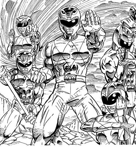
(Art by Jay)
I helped supervise the Jim Lee-style cover art for Sentai #2. Ben Dunn colored it.
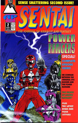
The Power Rangers' overnight success took everyone by surprise (well, everyone except us). There weren't many tie-in items available when the Power Rangers started to take off in America. Sentai #2 was one of the first English-language publications to feature them on the cover, and it was the best-selling issue in the series.
Also, while most of the American media downplayed the Power Rangers' Japanese origins, David Crowe contributed a hilarious episode-by-episode comparison between the American show and Zyuranger, the original sentai series.
I put David in touch with Steve Wang, who had directed two live action Guyver movies, and at that time was going to direct the first Power Rangers movie. David's interview with Steve was a highlight of the issue.
Eventually, longer-format stories occupied most of my time, and I was no longer able to contribute to fanzines like Mangazine and Sentai.